
Focus of the project: Redesign of the user and team management experience
My role: End-to-end product design
Success criteria: Reduction of support tickets, reduced time for onboarding and management of users and teams
Previous flow:
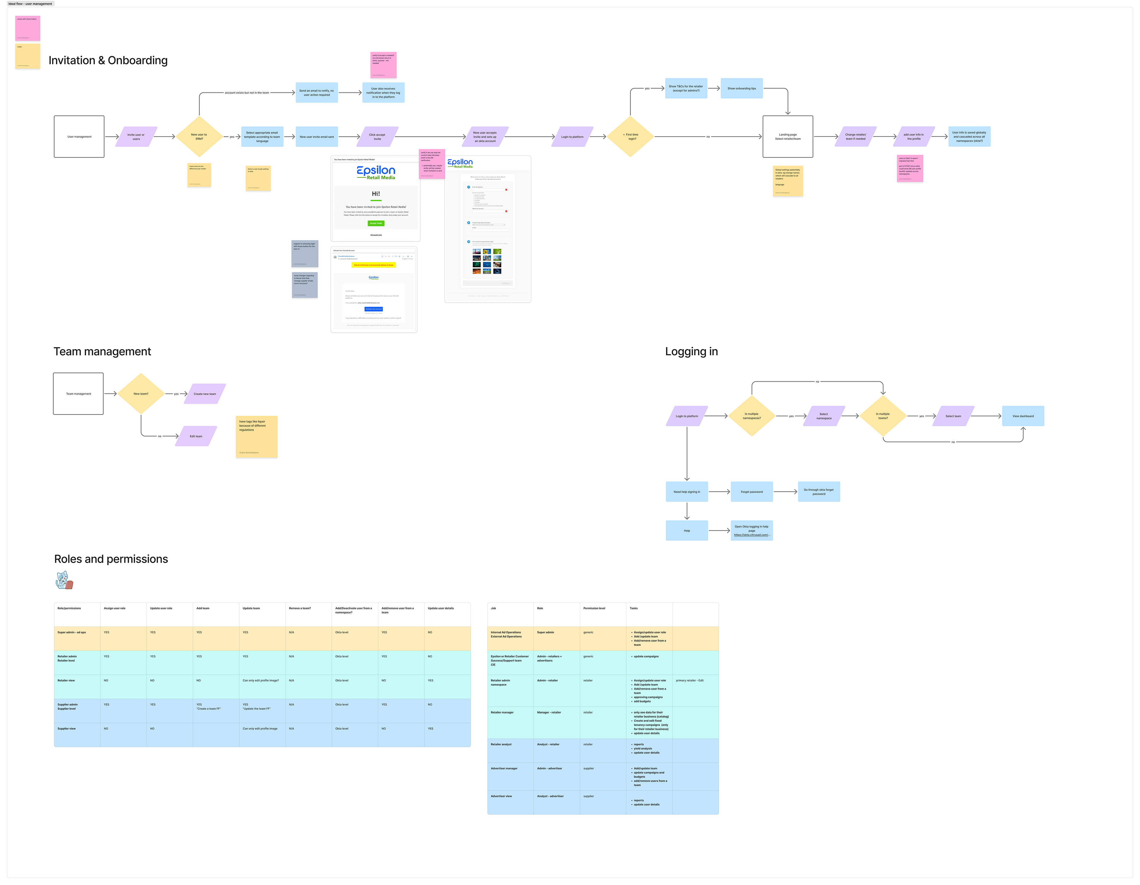
While redesigning the Citrus Client platform, I worked on rethinking and improving the user and team management flow to bring it to the Epsilon Retail Media Platform. It was a complex system with multiple flows that involved several other systems: authentication, email management, user interface, and the admin part.
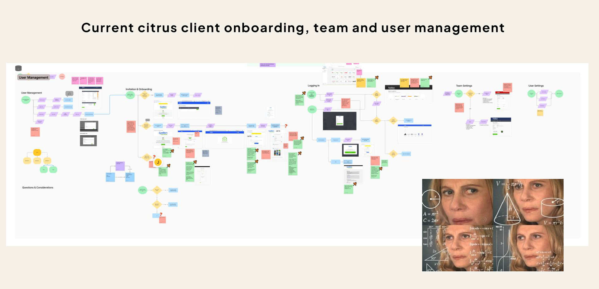
Previous onboarding, team and user management
Discovery and findings:
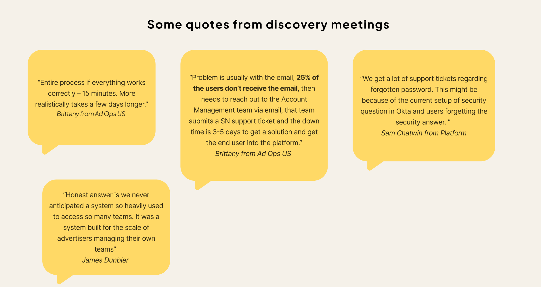
I collected the feedback from several key user groups via discovery interviews: advertising operations, engineering, platform maintenance, sales and the email management team. I also analysed the current flows through extensive research of the Confluence documentation and previous user interviews stored in Dovetail.
Main findings and pain points:
-Currently, user information is stored per namespace, which causes duplications.
-A new authentication system was added in some places, but not the other - this has left some legacy code/experiences that don’t align.
-No internal admin role - some users have to be manually added to tens of teams, which is very time-consuming. Also, sometimes this causes the landing page to crash.
-Onboarding emails are only in English - this means that people who do not speak English cannot onboard.
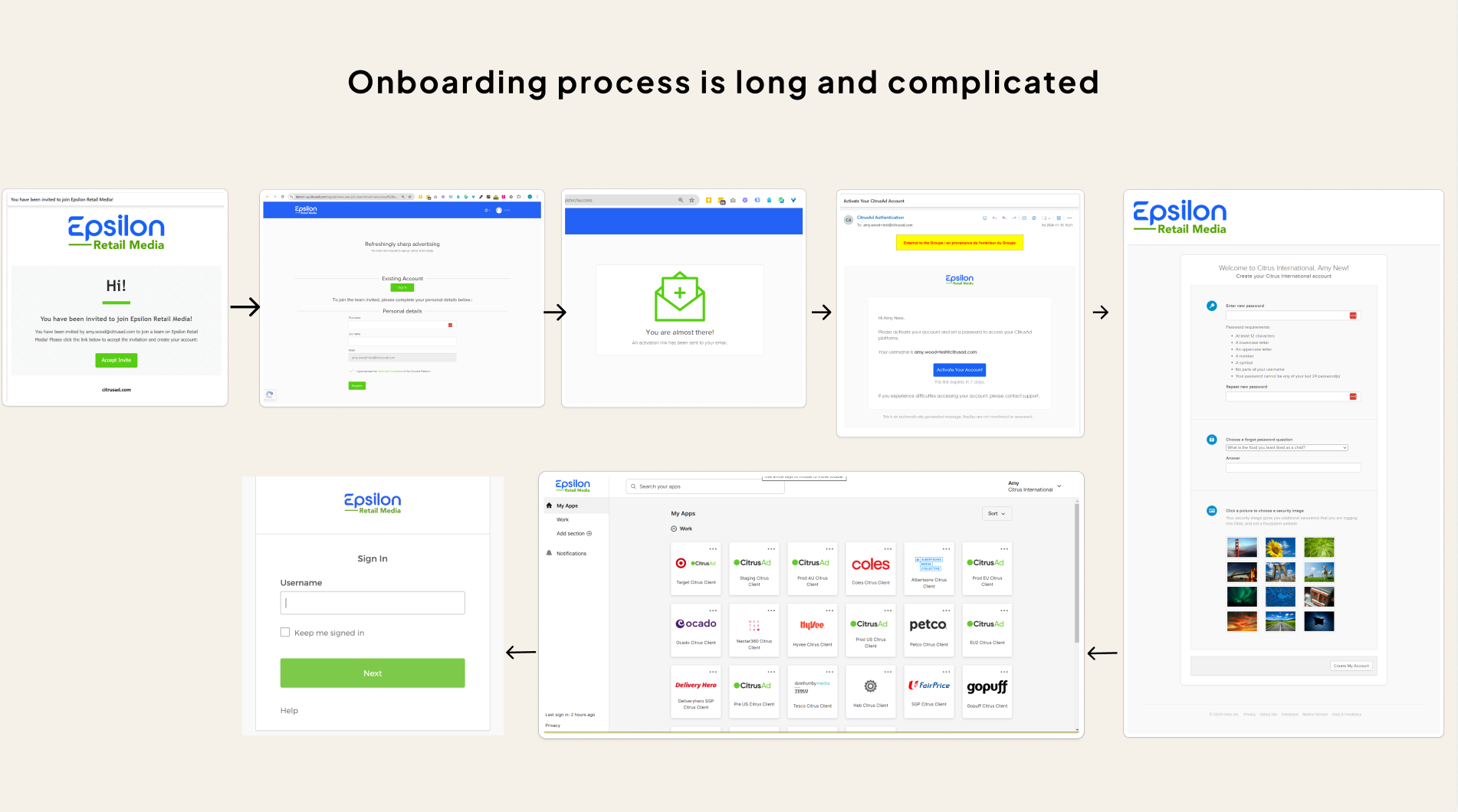
Onboarding process
-The onboarding process is long and complicated, where the user has to jump between several interfaces.
-25-60% emails are getting lost. Either due to going to junk, being blocked, or unknown issues with the email system.
-Unsure why we have pending invitations as a separate step, and users have to accept that manually to start using the system. But everyone agrees that it is an additional effort in the process.
-There is no way to archive a team that leaves hundreds of unused teams.
Simplified ideal user journey:
Based on the findings from the discovery stage, I worked on simplified, more efficient user journeys. Some of the improvements are as follows:
-Introduction of multi-lingual email templates: this will require determining the user's language and adding email templates in different languages in the email system.
-Simplified onboarding process: this will eliminate “unnecessary” steps in the current process and reduce the number of steps from 7 to 4.
-Introduction of an admin role
-Global user information: at the moment, user info is saved per namespace, which causes a lot of duplication. User info should be stored globally.
High-fidelity designs
Adding user to the team
Adding user to the team
User problem: When users were added to a team, they had to manually accept the invitation before accessing the platform.
Outcome: The manual acceptance step was removed, allowing users to access and start using the platform immediately.
Outcome: The manual acceptance step was removed, allowing users to access and start using the platform immediately.
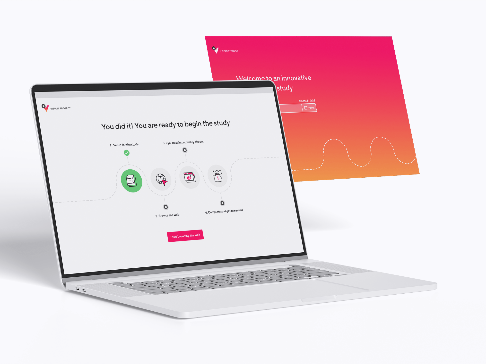
After mapping the previous and ideal user journeys I identified a user pain point which was slowing down the onboarding process. For a new user to start using the platform, they had to be first added to the team which would send an email to this person. Then this user had to click on the link in this email proceed to received invitations page and accept the invitation from there. Unfortunately, from user testing and through talking to various customer service specialists, I identified that around 25-60% of these emails were getting lost. This resulted in slower onboarding as the user had to raise a support ticket to receive a team invitation email again.
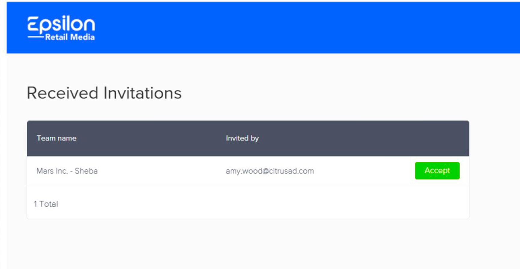
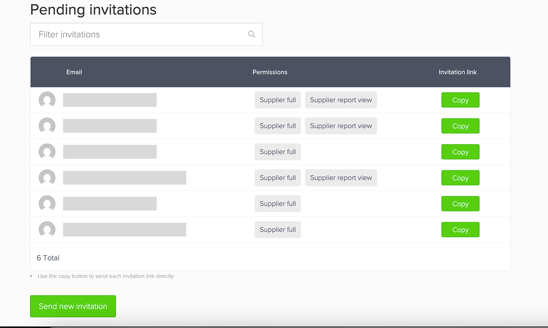
Previous design - received invitations page
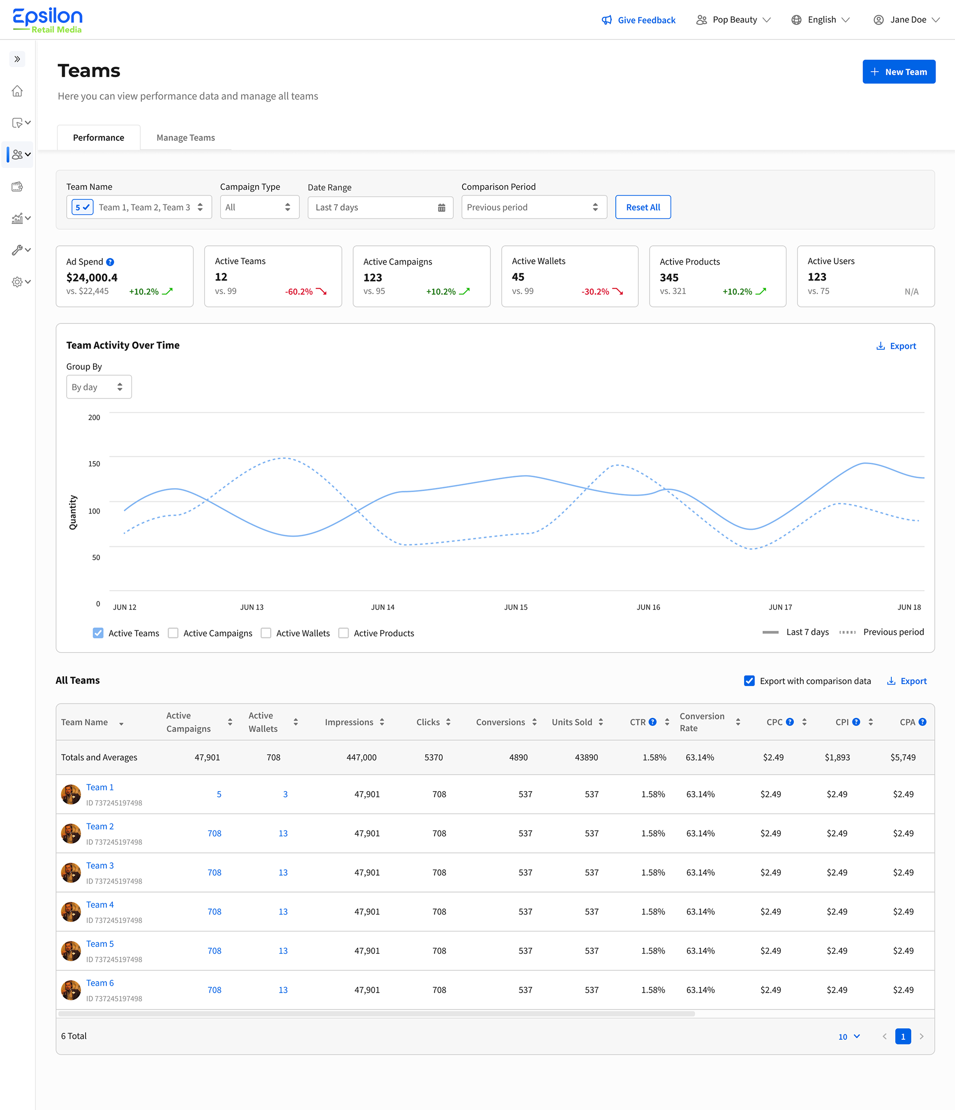
New Teams page - users can use the platform straight away
Account creation and emails
User problem: Registration emails during account creation were only available in English, creating a poor experience for non-English-speaking users.
Outcome: Account creation page was redesigned to support multilingual email communications.
Outcome: Account creation page was redesigned to support multilingual email communications.
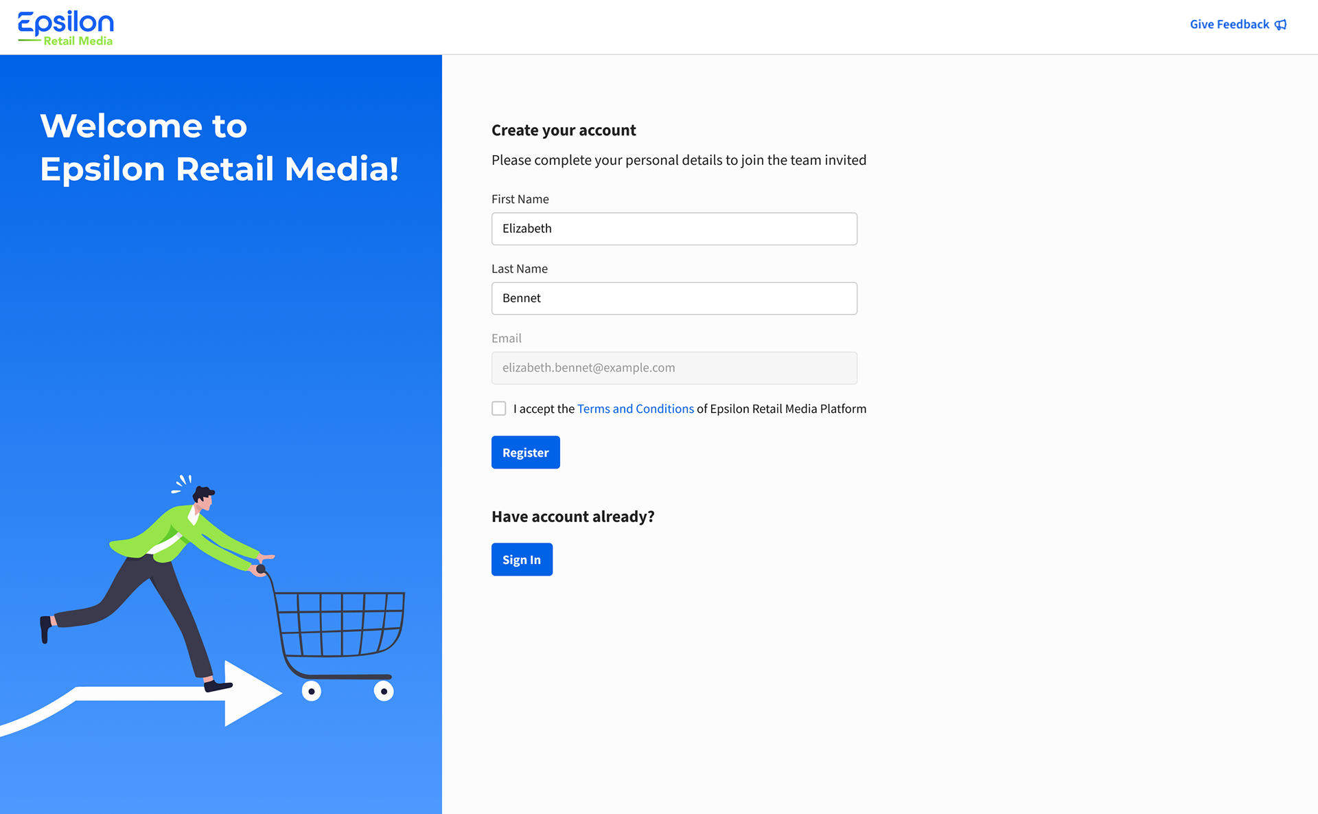
Account creation page (by invitation only)
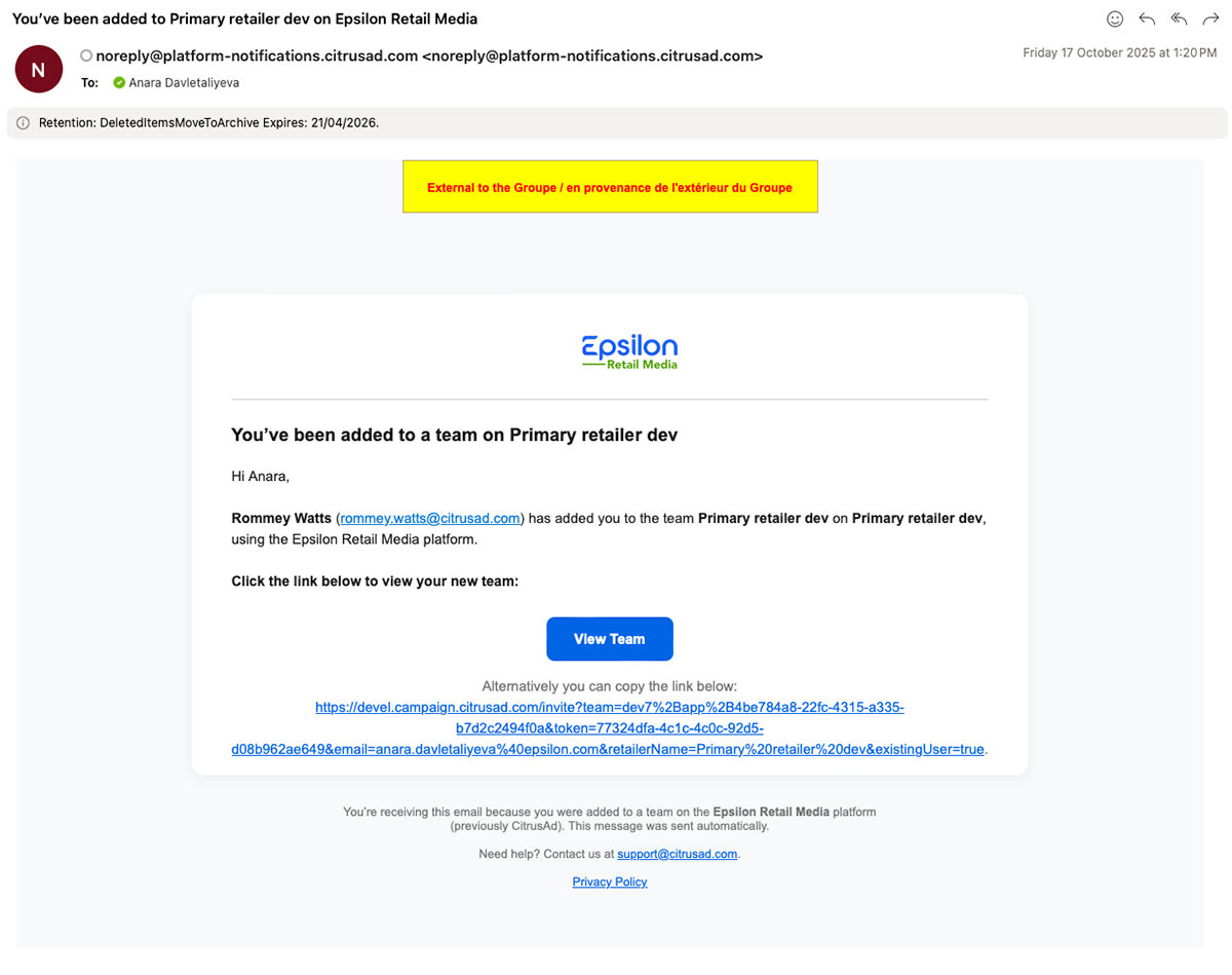
Email example
Team archiving and pending invitations
User problems: There was no way to archive or unarchive teams, and pending invitations were managed in a separate view, making team management less efficient.
Outcome: Introduced archive/unarchive functionality, resulting in faster page load times and easier team search. Pending invitations were also consolidated into a single users table for a more streamlined management experience.
Outcome: Introduced archive/unarchive functionality, resulting in faster page load times and easier team search. Pending invitations were also consolidated into a single users table for a more streamlined management experience.
In the previous platform there was no way to archive the team which resulted in big lists of teams that were meant to archived. Some users added "archived" in the team or "Z" so that the team would go to the bottom of the list of teams. Additionally, when loading the teams page all the teams were loaded which slowed the page load and filtering. We found a few thousand archived teams in the database.
In the new design users per team were consolidated in one table, whilst the previous platform had two separate tables: pending users and users who have the full rights to the platform which resulted in a more difficult user search.
In the new design users per team were consolidated in one table, whilst the previous platform had two separate tables: pending users and users who have the full rights to the platform which resulted in a more difficult user search.
Pending users table on team users page
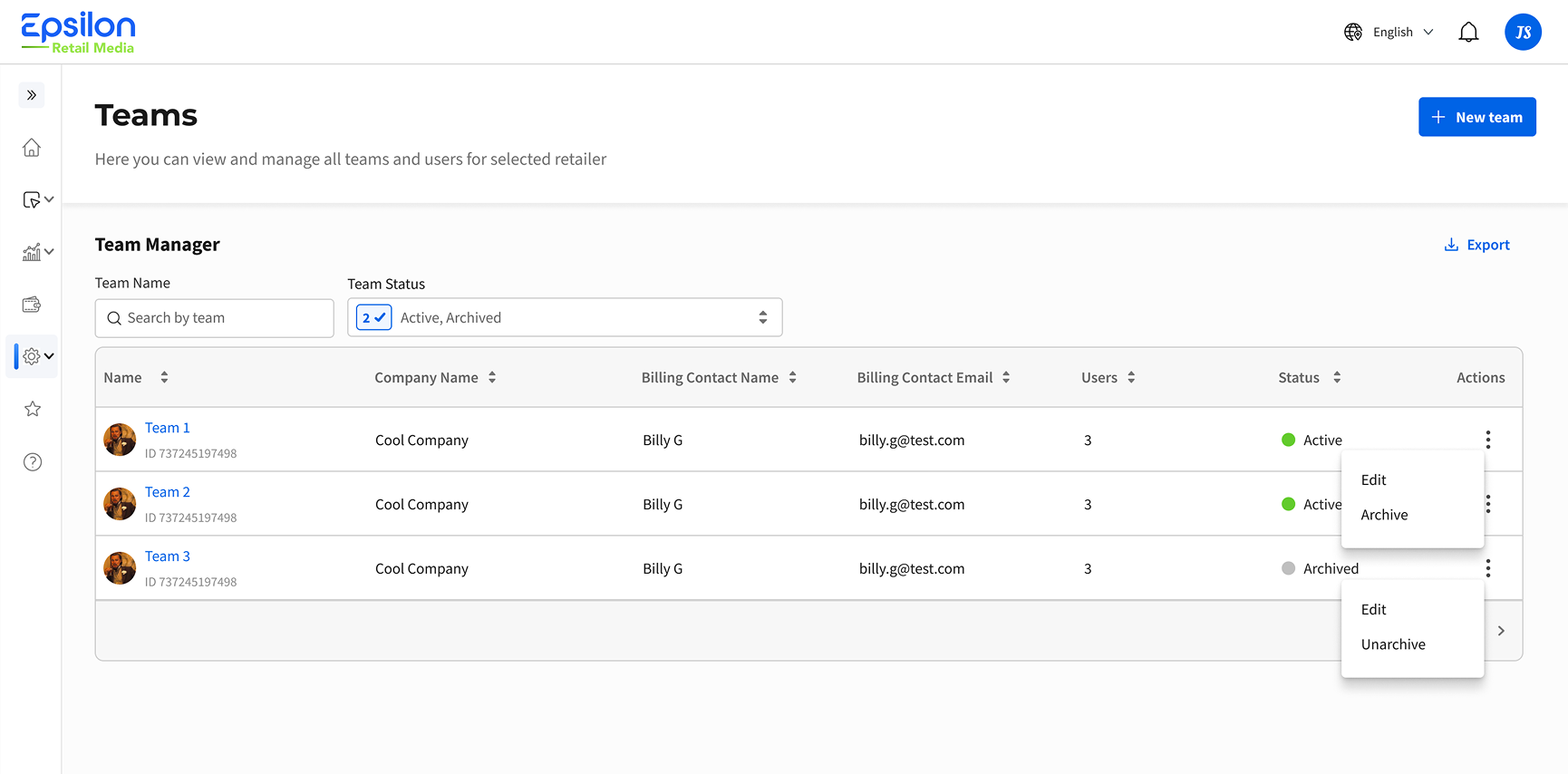
Archive/unarchive functionality and consolidated table
Outcome and learnings:
- Although I was initially tasked with redesigning only the UI, I felt it was important to understand the entire onboarding journey, which uncovered several major friction points in the process.👨🏻💻
- Overall feedback was very positive, with most users finding the proposed design intuitive and easy to navigate.👥
- The onboarding process was simplified from 7 steps to 4, reducing the overall time required to onboard new users. ✅
- The number of customer support requests decreased, particularly those related to team invitations and onboarding issues.👇