Focus of the project: Redesign of a retail SaaS platform (ERMP)
My role: Design strategy, end-to-end product design
Success criteria: Improved UX experience, 100% adoption of the new retail media platform
Epsilon Retail Media Hub is a retail SaaS platform which was formerly known as a Citrus Client developed by a company called Citrus Ad. Citrus Ad was acquired by an US-based company Epsilon and there was a need to redesign the platform to align the branding and improve the user experience. I came on board as a senior product designer to help with the product design and design strategy of the platform. There was a strong need for design strategy as there was no one in product design leadership at that time.
Main challenges at the start of the project
-Limited design capacity - product design team was down from 4 people to 1
-Transitioning from CitrusAd branding to Epsilon Retail Media branding
-Fragmented user experience - separate reporting and campaign management tools which had to be unified
-Operating in a fast paced environment with tight deadline
-The process of planning design work ahead had a room for improvement
-Due to limited design capacity there was no overall ideal user journey and overall look

Similarity with building a house without a blueprint
Improvements in design planning
In order to improve the design planning and visibility and to make sure the design is done a cycle ahead of engineering I proposed to establish a design board in Jira and move the design tasks from the third party tool used at the time. This would bring the following improvements:
-Better visibility of design tasks as members of cross-functional team had access to Jira and all engineering planning was done there. The previous tool used for design tasks was only accessible to a few people.
-Better planning of design tasks via 2-week design sprints. This would improve the process of finalising design tasks ahead of engineering work.
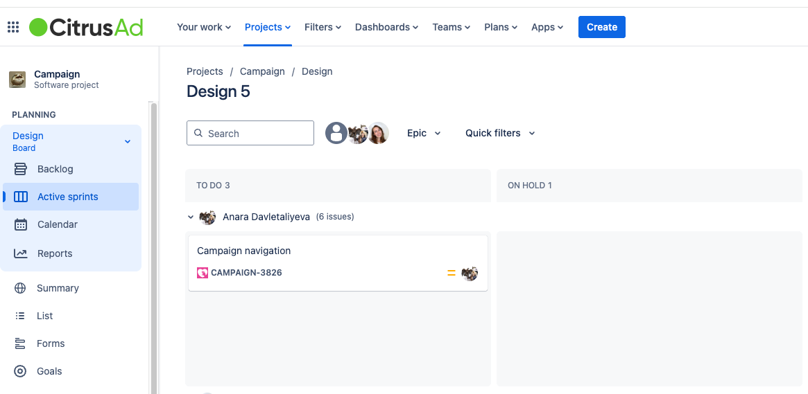
Design Jira board
Design sprint
In order to tackle the other problems with the platform I proposed to run a reporting design sprint. There were a few goals of this design sprint:
-Come up with an ideal user journey an navigation of the platform that would combine the campaign management and reporting in an intuitive way
-Go through the main user pain points of the old platform
-Think of an overall look and feel of the platform
-Re-examine the reporting and think how to present it in a more digestible way
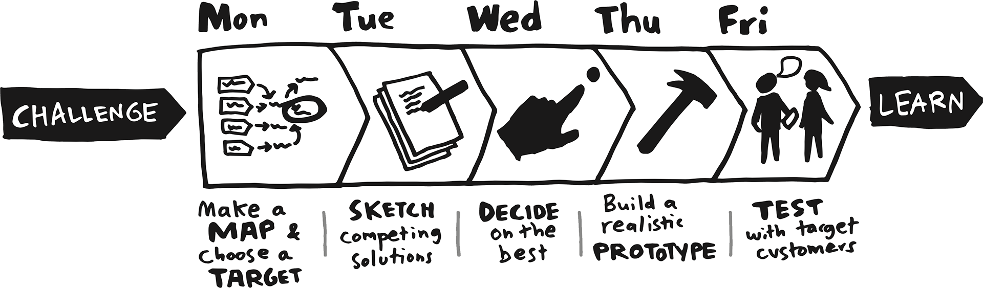
Design sprint usually runs for a consecutive 5 days, but due to the small size of products design and the rest of the design workload it was only possible to allocate 5 afternoons. Additionally, the user testing was done in the couple of weeks after main design sprint work was done.

The plan for the design sprint

Voting on HMWs
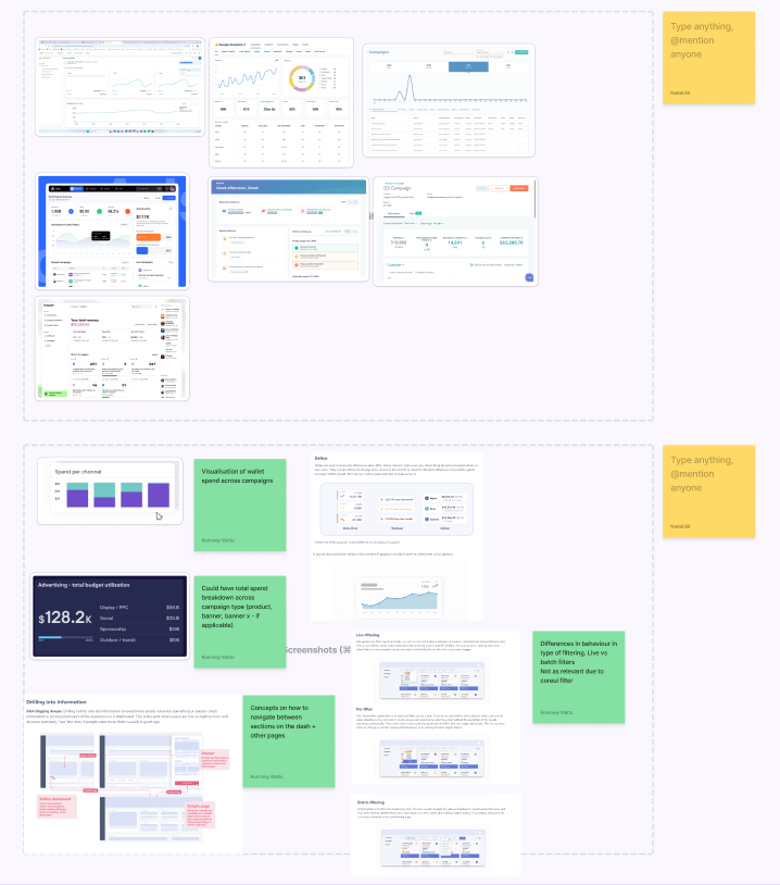
Moodboarding
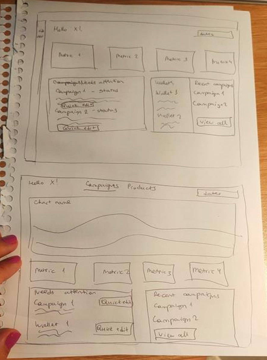
Wireframes
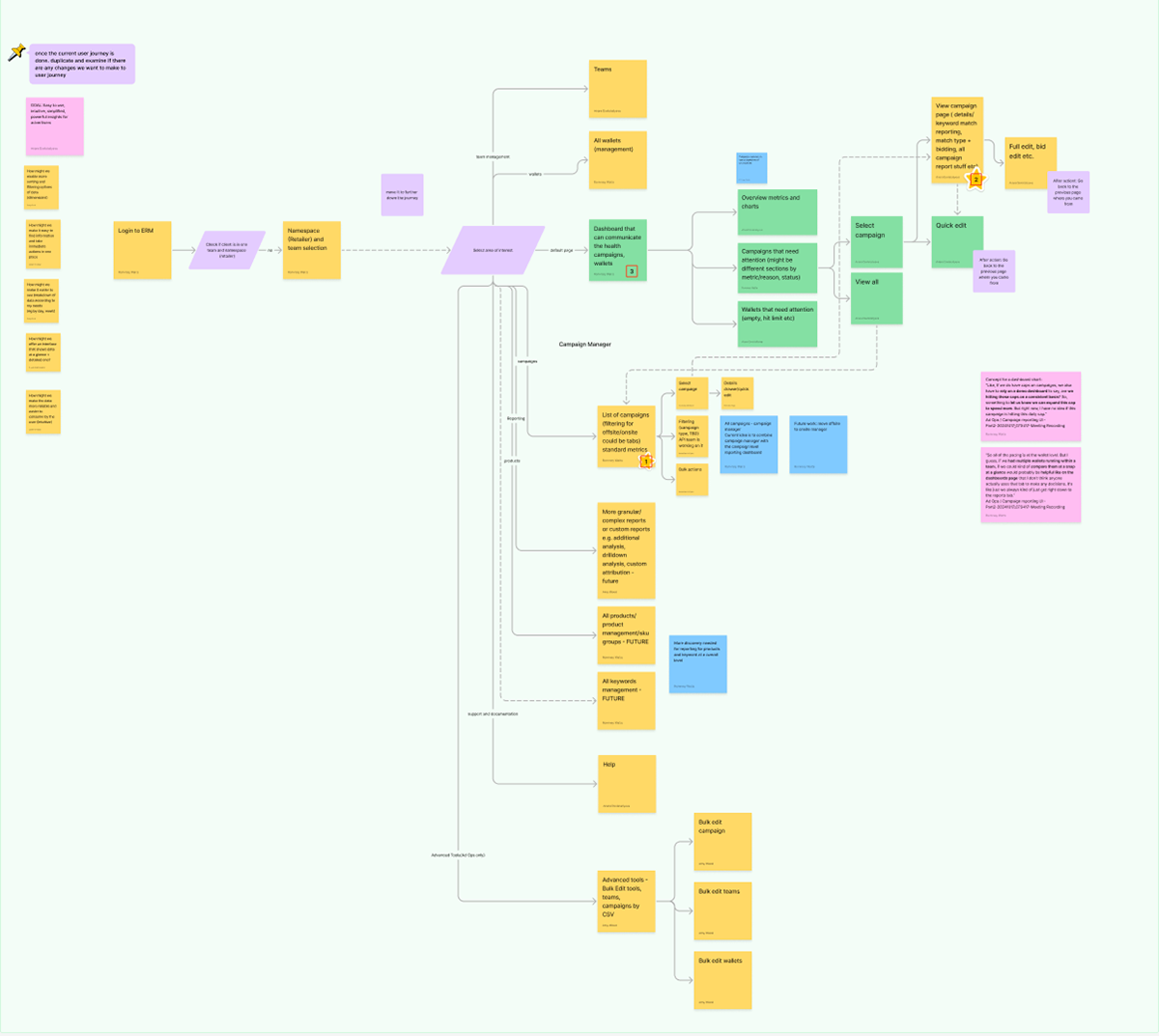
Ideal user journey and navigation
After workshop and a few revisions design team mapped out the ideal user journey with the current and new pages needed. As a start we prioritised the top 3 areas to focus in the prototype: individual campaign page, campaign level reporting and the dashboard/landing page.
Prototype and user testing
Design team then created prototype and the test plan and interviewed 5 participants from different departments like sales, operations and external agencies. Main feedback themes were:
-Customisation of metrics and columns
-Customisation of metrics and columns
-Actionable insights for the campaigns
-Ability to export tables and graphs in different formats
-Consolidated reporting in one place
-Intuitive and persistent filtering across the platform
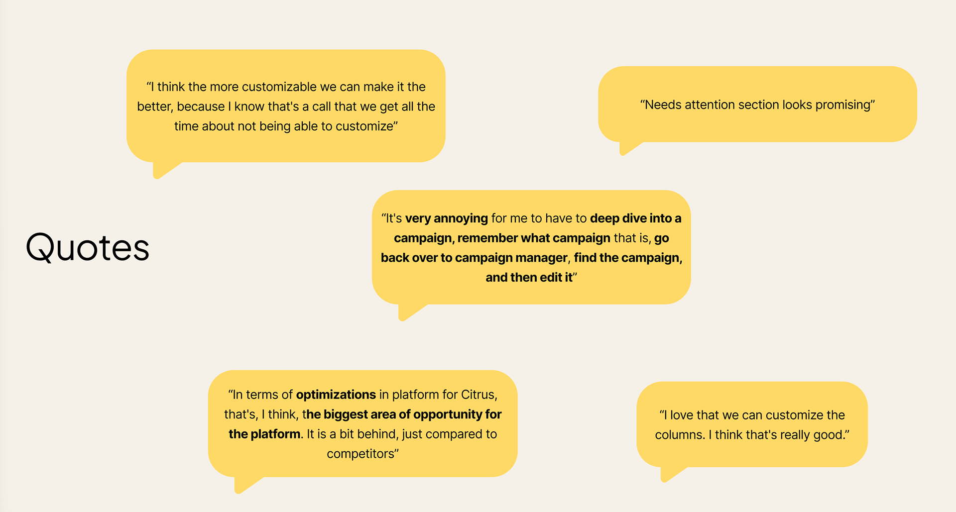
Quotes form user testing interviews
High-fidelity designs
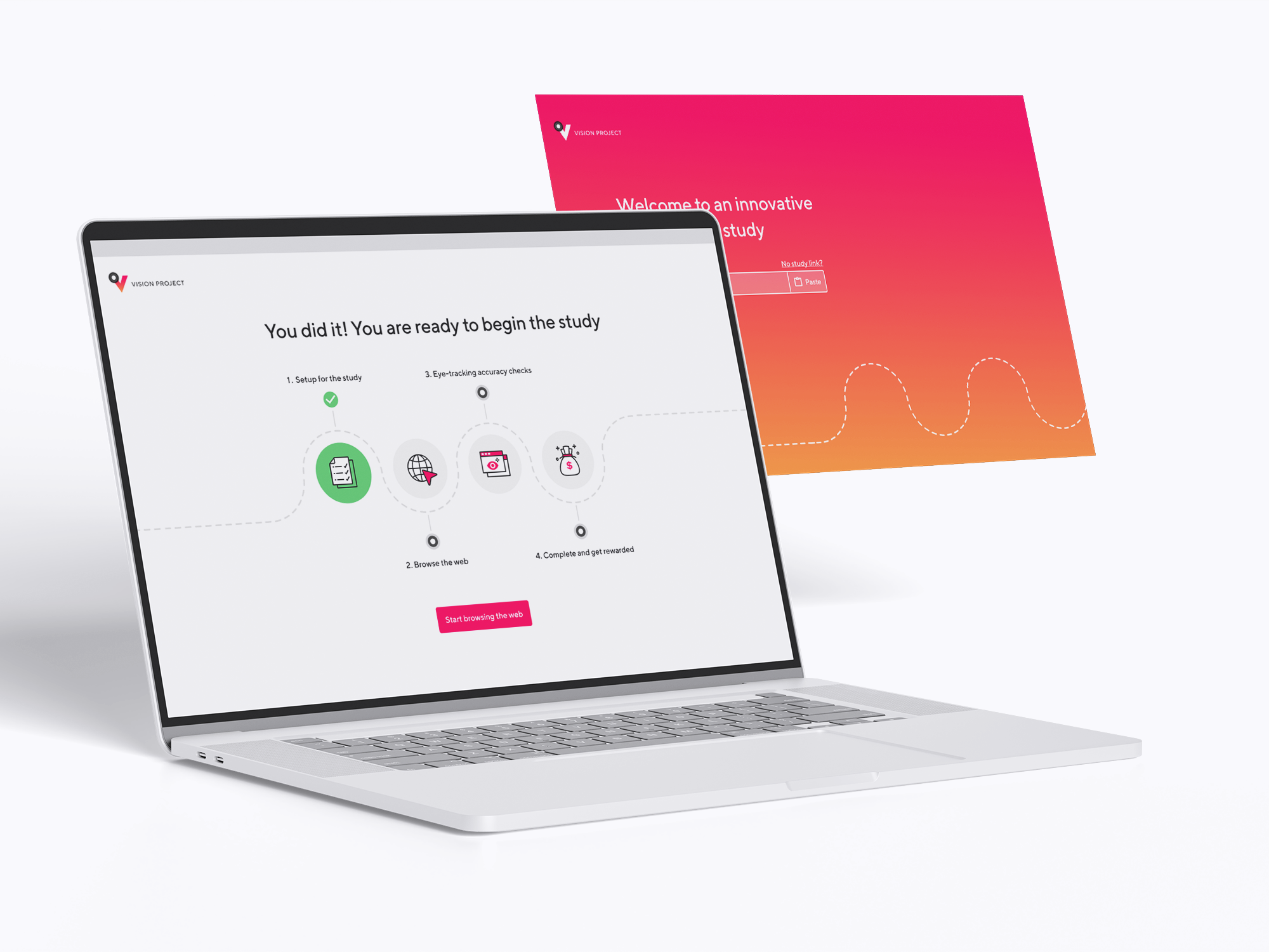
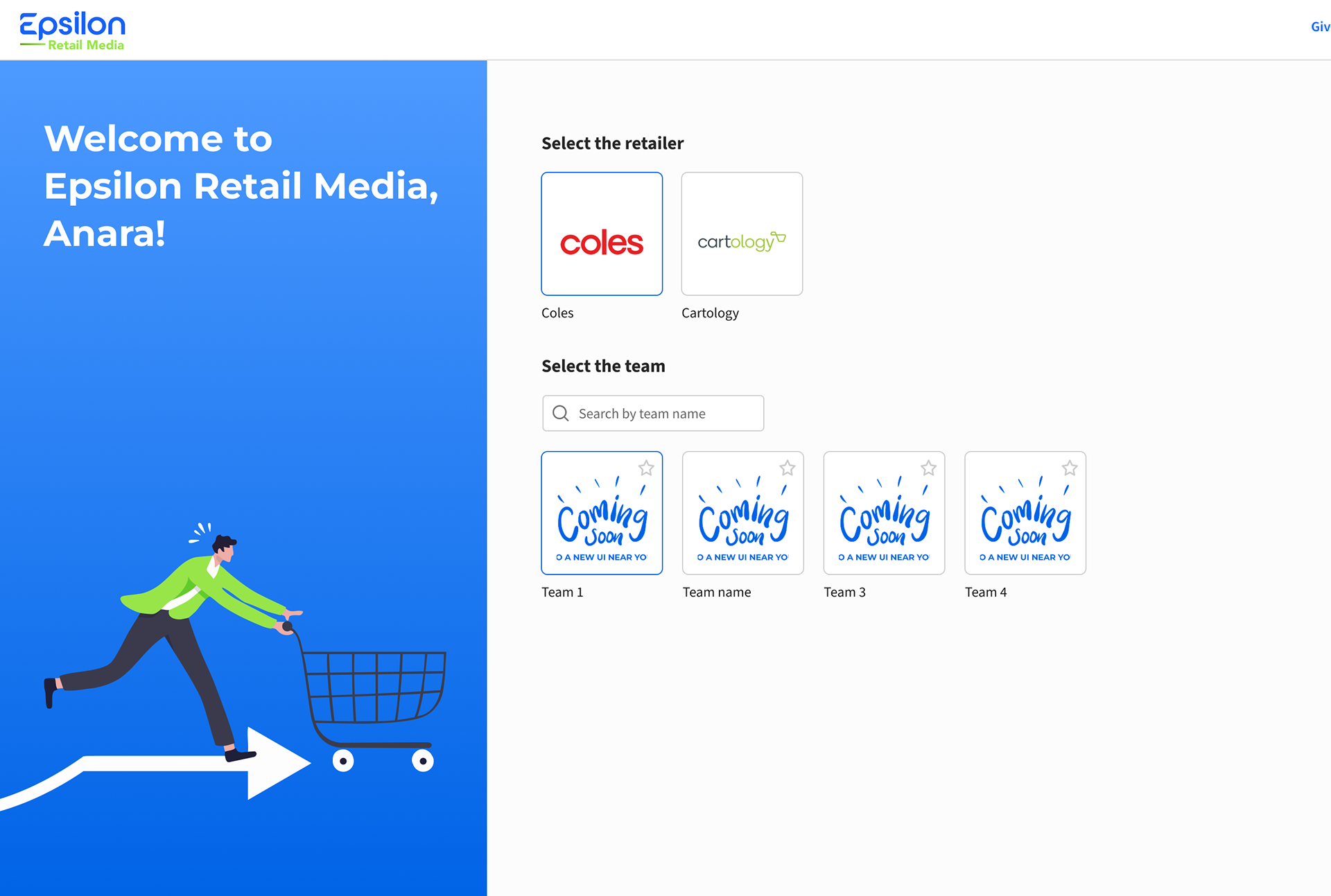
Welcome page
Welcome page
User problem: There was no dedicated welcome page for users to select a retailer or team when entering the platform, and there were limited branded visual resources available.
Outcome: Designed a new welcome page that allowed users to easily select their retailer and team, while also incorporating available illustrations to create a more polished and branded onboarding experience.
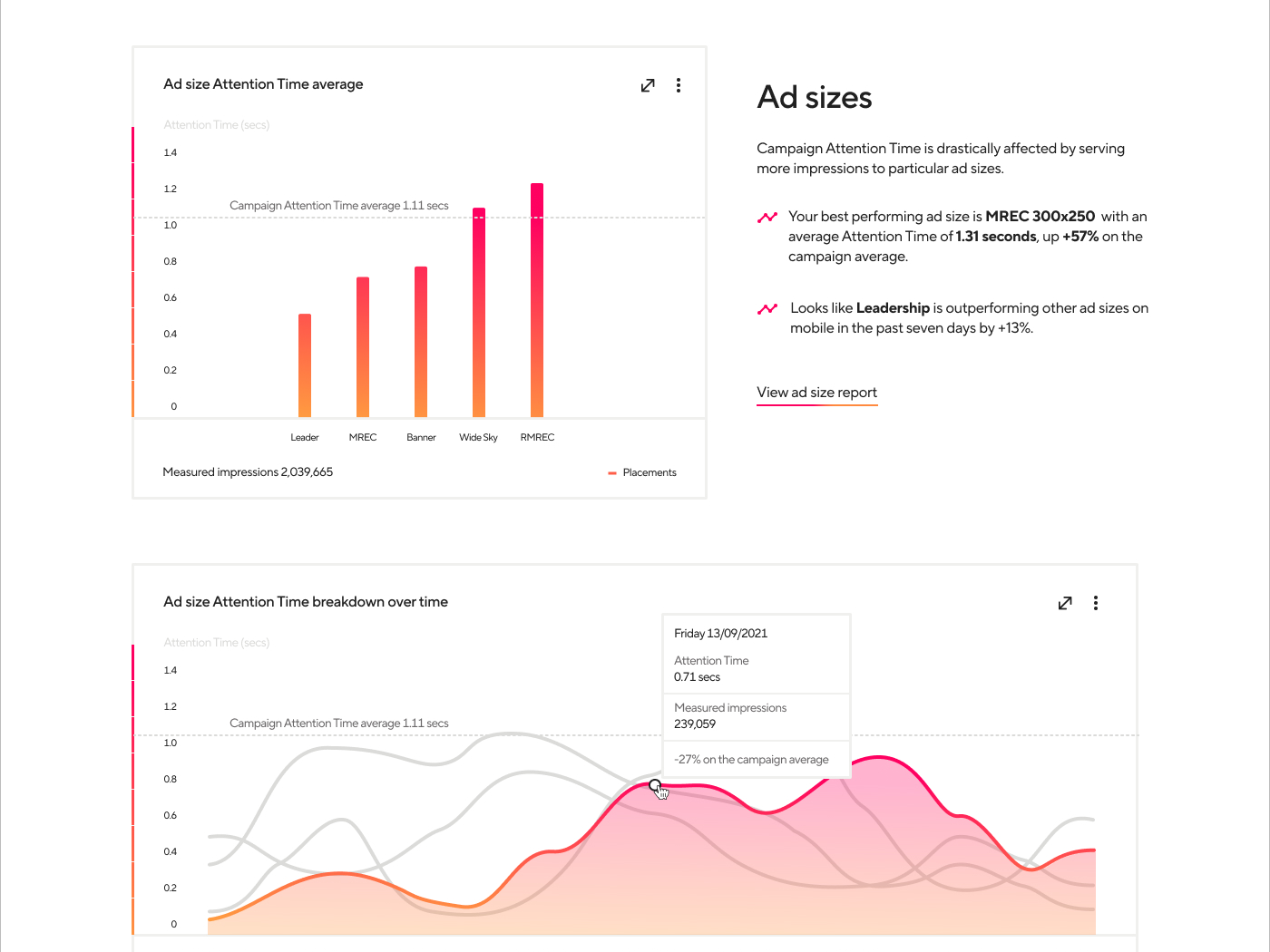
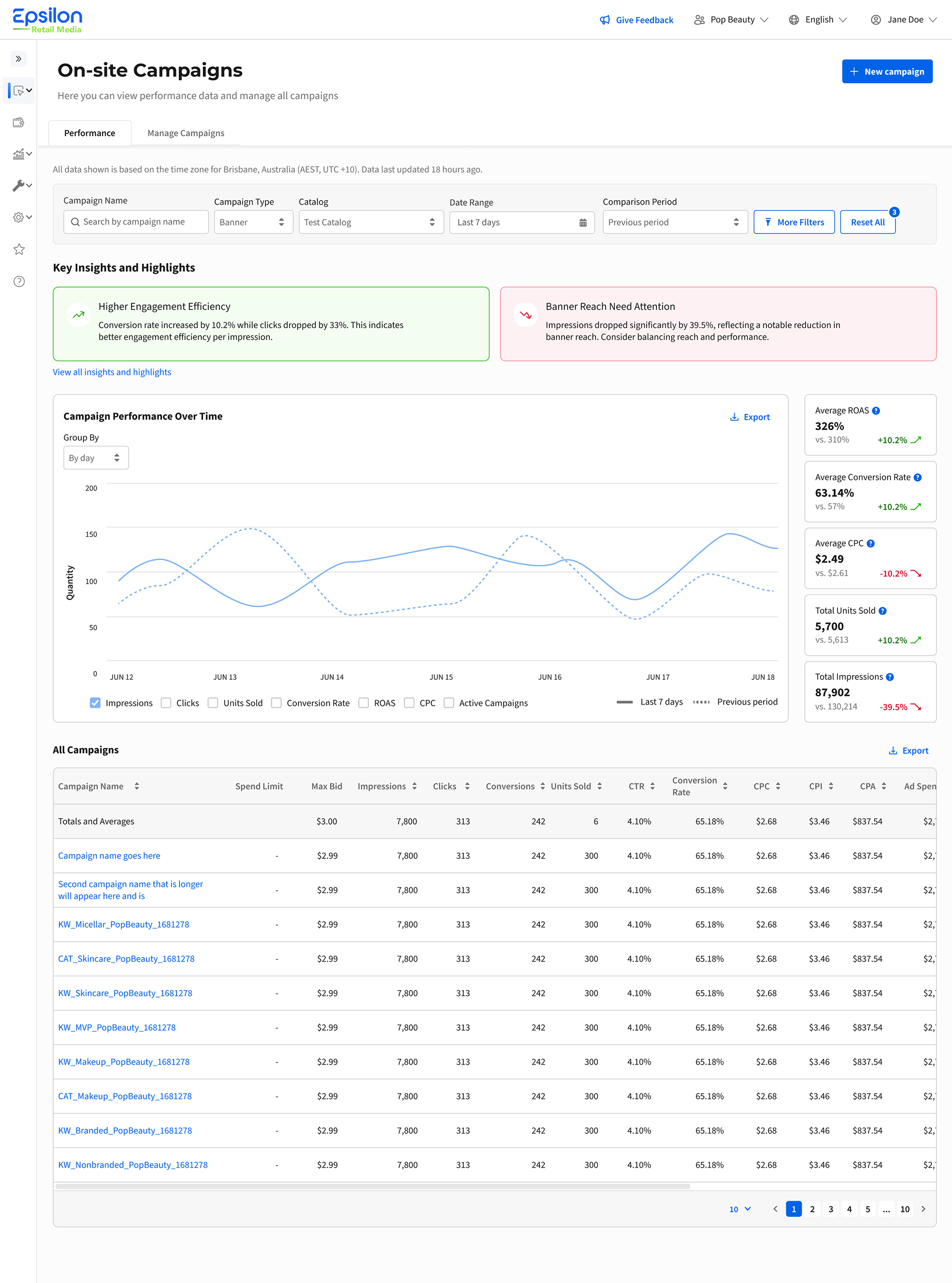
Campaign performance page (AI hackathon first prize 🏆)
User problems: Users didn’t have a clear or efficient way to identify which campaigns were performing well and which required attention. The previous platform also lacked the ability to compare campaign performance across different time periods.
Outcome: I designed a campaign performance dashboard that presented campaign results through both visual charts and detailed tables, making performance analysis faster and easier to understand. Users could compare results across custom time periods, including year-over-year and month-over-month performance.
Additionally, I designed an insights and highlights section that surfaced key trends and notable changes across campaigns, helping users quickly identify opportunities and issues. The concept was later developed into a prototype during a company-wide hackathon, where it won first place.
Additionally, I designed an insights and highlights section that surfaced key trends and notable changes across campaigns, helping users quickly identify opportunities and issues. The concept was later developed into a prototype during a company-wide hackathon, where it won first place.
Campaign performance dashboard
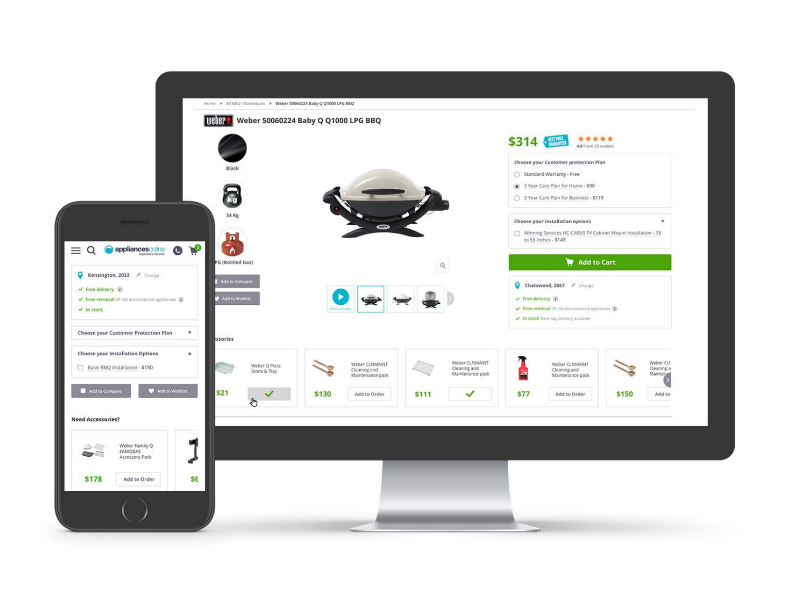
Campaign management page
User problem: Users had to navigate a large number of metrics and filters that varied depending on the retailer.
Outcome: Introduced customizable table columns, allowing users to tailor views to their specific needs and priorities. Additionally, designed a global, persistent, and responsive filter bar that created a more efficient and consistent experience across the platform.
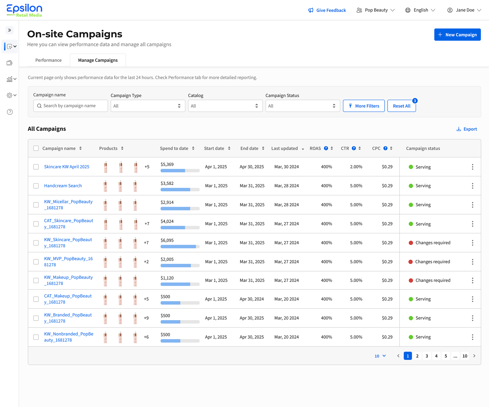
Campaign manager page

Customisation
Campaign details page
User problem: Campaign reporting was spread across multiple pages in the previous platform, forcing users to constantly switch between screens and slowing down their workflow.
Outcome: Consolidated campaign reporting into a single, centralised experience, making information easier to access, reducing context switching, and improving overall efficiency and usability for users managing campaigns.
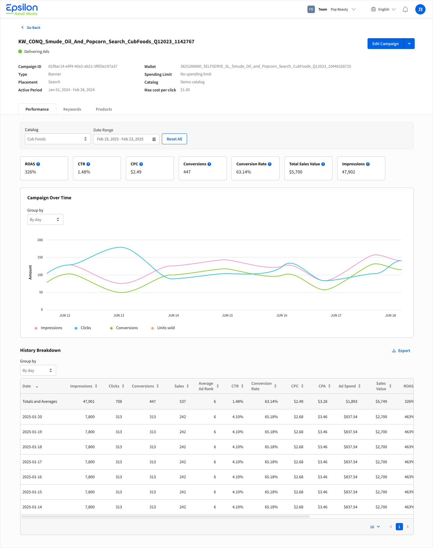
Single campaign page
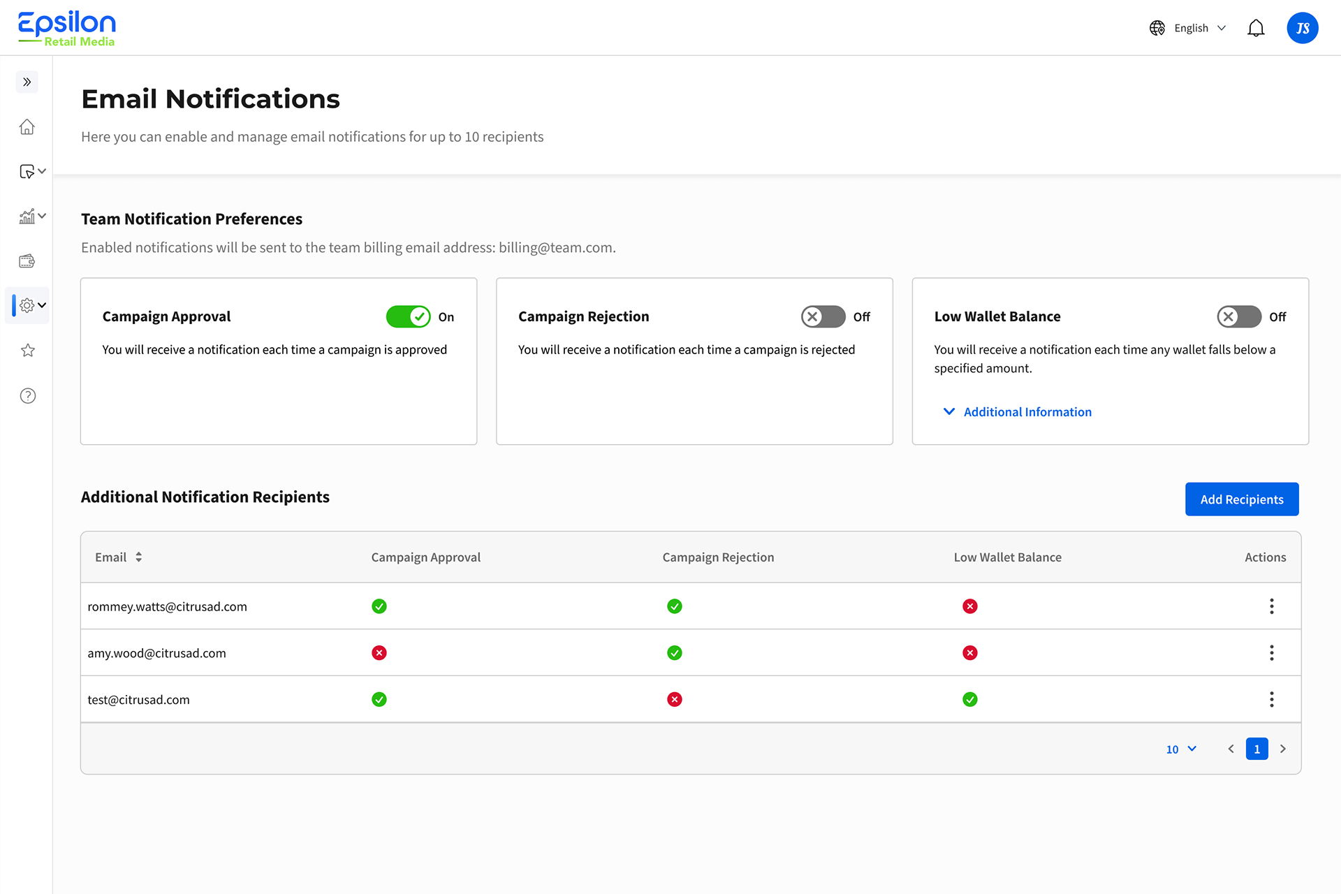
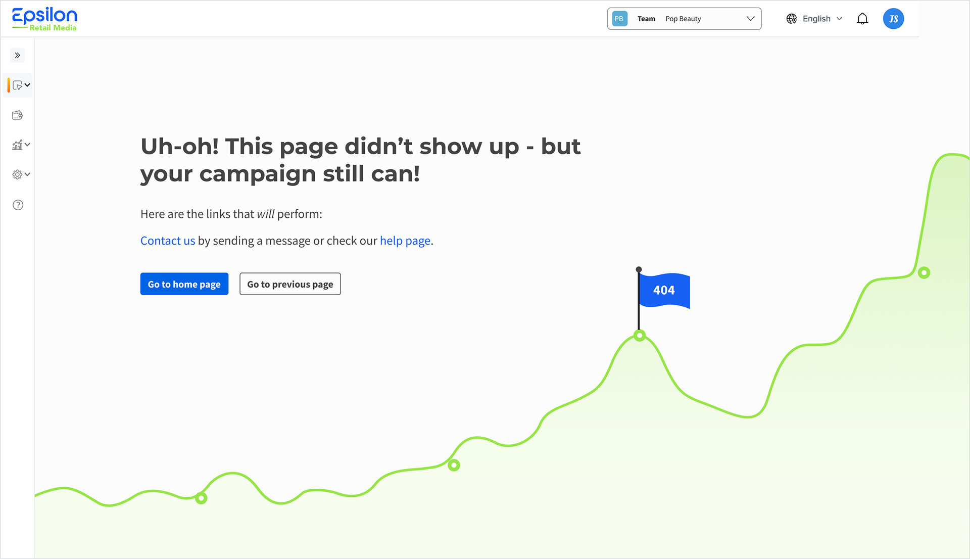
Email notifications page and 404 pages were added later.
Outcome and learnings:
- The design sprint proved to be a highly valuable way to accelerate the project and align the team early in the process. 🏃♀️➡️
- By first focusing on the ideal user journey and navigation structure, it became much easier to design the remaining pages and create a more cohesive experience.📍
- Stakeholders were pleased with both the speed of progress and the positive feedback received from users throughout the process.😊
- A significant amount of user feedback and identified pain points were addressed and incorporated into the final designs. 👥