Appliances online is an ecommerce platform that specialises in selling appliances. Few core pages like product and shopping cart pages on the platform were not performing to their fullest potential and there was a need to increase conversion rate. Main focus was to analyse how pages are performing, what can be improved and redesigned, come up with a new design and measure it using A/B tests.
My role : UX research, UI design, running A/B tests and data analysis.
Background of the project:
Appliances online is an ecommerce platform that needed more UX design resources and processes applied to analyse existing design of the website and come up with redesign if needed. I joined UX team as a UX/UI designer with a focus on quantitative and qualitative analysis. I scanned the core pages of the website that form the main funnel and identified potential areas for improvement.
Redesign of accessories section :
When looking at accessories section on product page I noticed that it was in the form of checkboxes list and hardly visible. This made it very hard for users to notice accessories, especially taking into consideration that there were no images for accessories. I made it a carousel of accessory tiles with image, price and description. I then ran A/B test until statistical significance was reached.
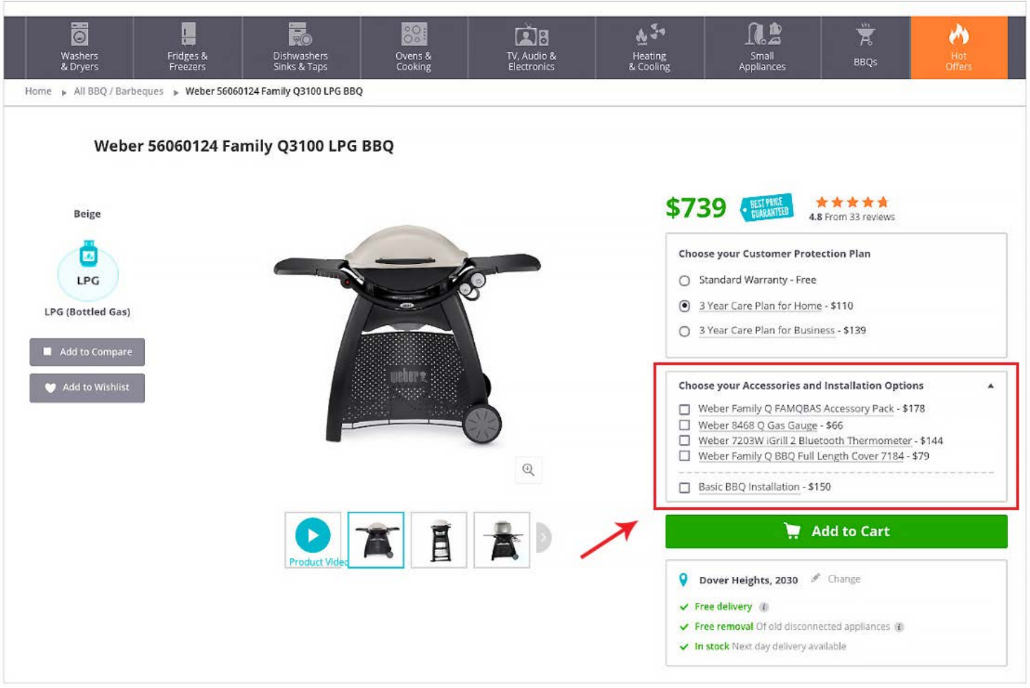
Before
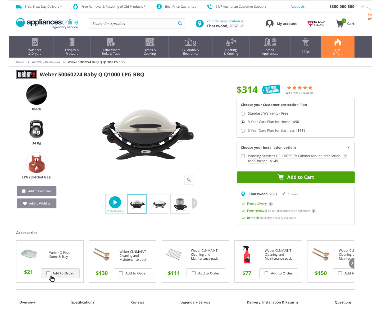
After
Outcome:
- Average number of accessories sold increased from 1.55 to 1.6 ☝
- Average order value increased from 1008.92 to 1014.67 ☝
Redesign of shopping cart page :
When analysing the shopping cart page of Appliances online I noticed that there was an opportunity to make the page more compact and remove unnecessary repetition of information. Initially idea was just to redesign the postcode section to increase number of people providing their postcode before proceeding to checkout, but I suggested that we could change the whole page. After that I redesigned the page to eliminate unnecessary repetition of information, redesigned the postcode section and reordered page content to put important sections first. After responsive design was finalised I ran A/B tests both on desktop and mobile until statistical significance was reached. As I was a developer back then I also implemented the new design.
Main issues were:
- Checkout click-through was lower than expected
- Email capture ratio was low as it was the first thing that was asked from users and they didn't see the value of it yet
- There was unnecessary repetition of information
- Postcode and the main selling point - free delivery were not prominent
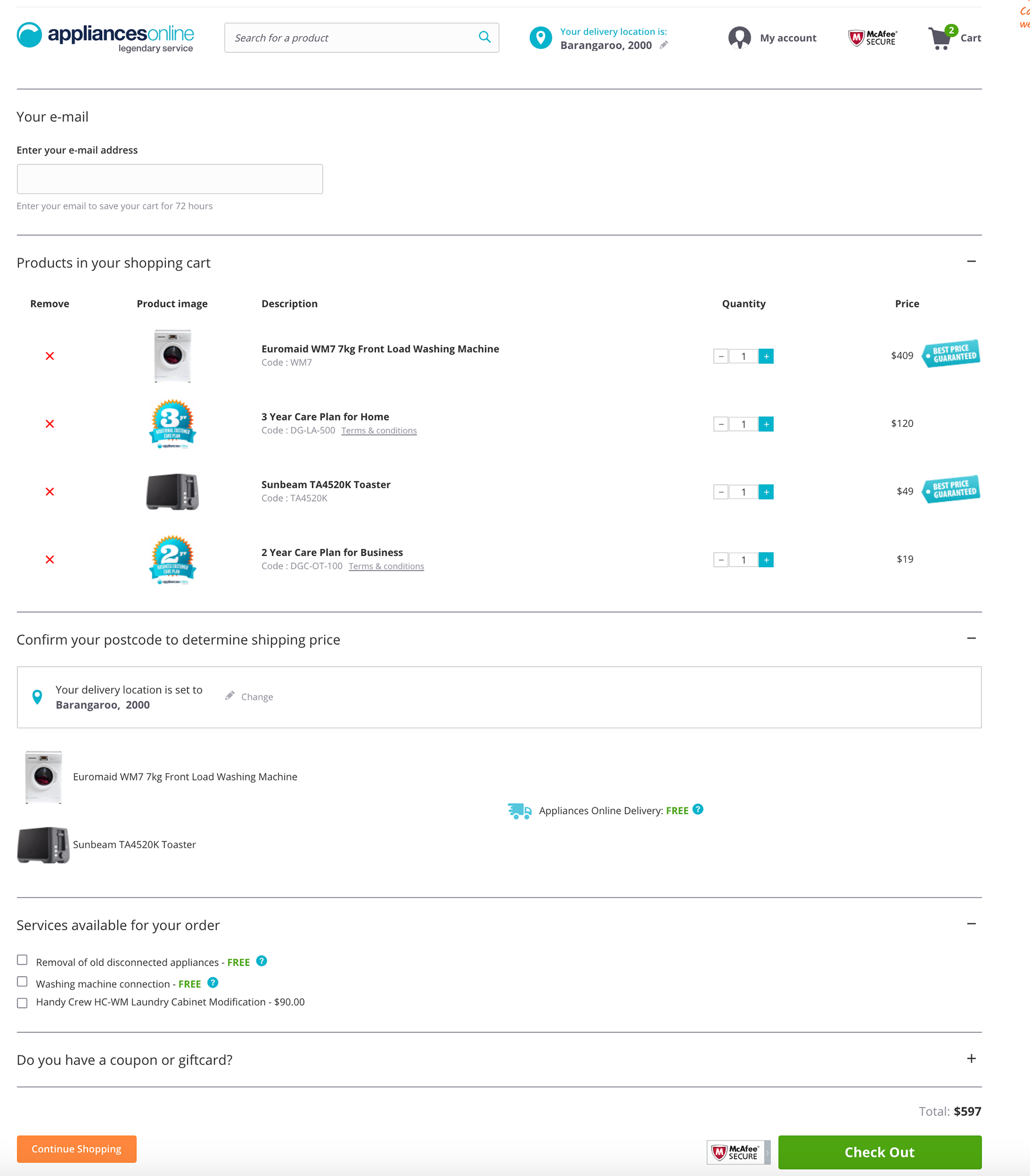
Before
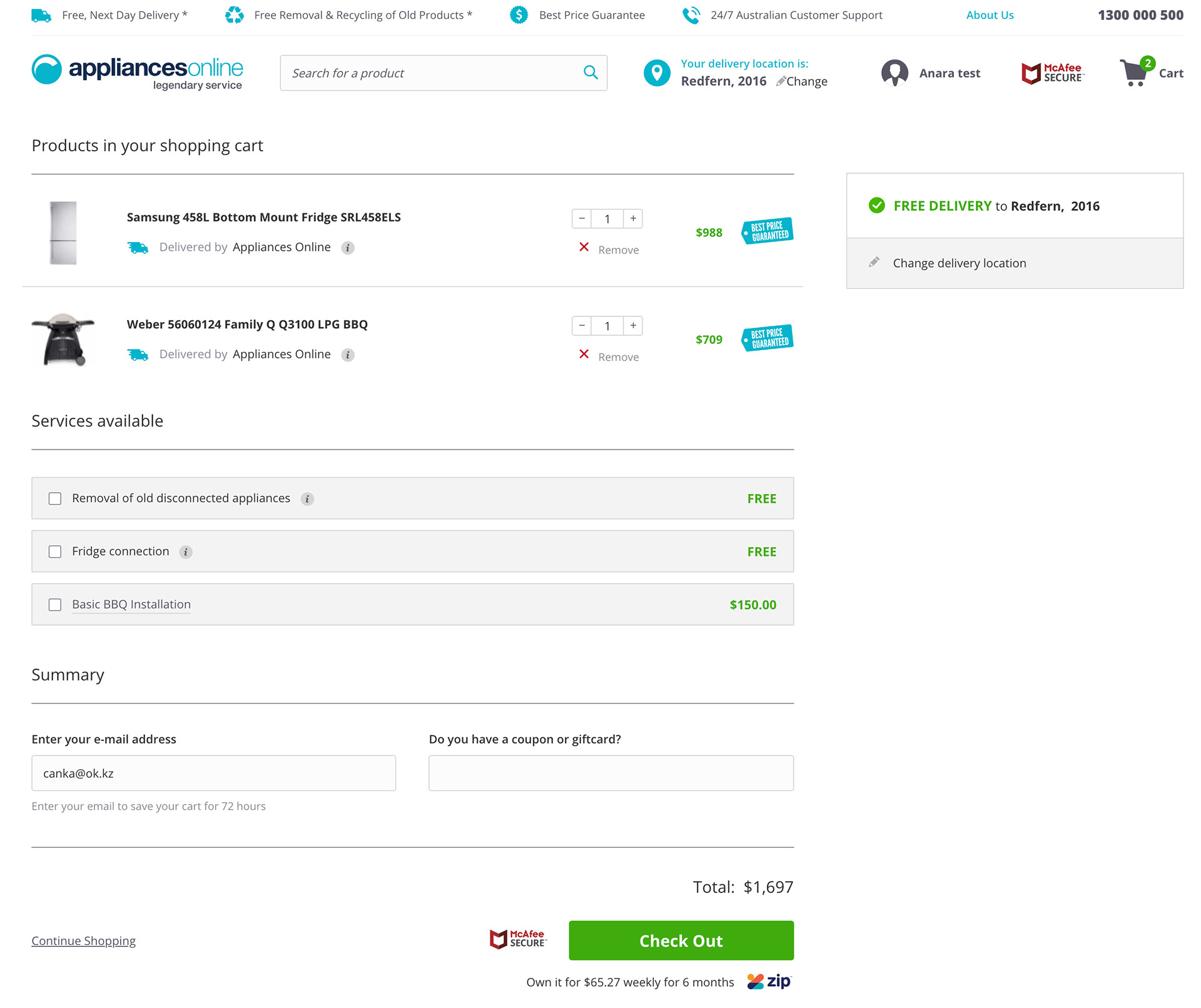
After
Outcome:
- Checkout click-through rate increased by 1.16% ☝
- Email capture ratio increased by 4.4% ☝
- Unnecessary repetition of information was removed
- Postcode and the main selling point - free delivery - has become more prominent
Learnings:
When working on a brief it's always good to look at a broader picture and see if there are more global issues that can be fixed which can result in bigger improvements and higher impact on the business. If I followed the brief which was to fix one section of the shopping cart page, I would have missed a bigger opportunity to redesign the whole page and achieve incredible results for both users and business.


